Spectra plots
A spectra plot is a simple x,y plot of spectroscopic data with sensible defaults. It will for example, automatically find an appropriate major and minor tick spacing. It defaults to using wavenumbers as the x axis as that is what we commonly use in our research group. This can be easily overridden, however (see configuring plots) the goal is to be able to produce fast plots of spectra with sensible defaults that can be stylized to your tastes after.
We can create a spectra plot simply with this code:
from pyet_mc.plotting import Plot
from pyet_mc.pyet_utils import random_spectra
if __name__ == "__main__":
    wavelengths = np.arange(400,450, 0.1) #generate some values between 400 and 450 nm
    wavenumbers, signal = random_spectra(wavelengths, wavenumbers=True)
    figure = Plot()
    figure.spectra(x, y, name = 'an example') #give the data a name for the legend
    figure.show()
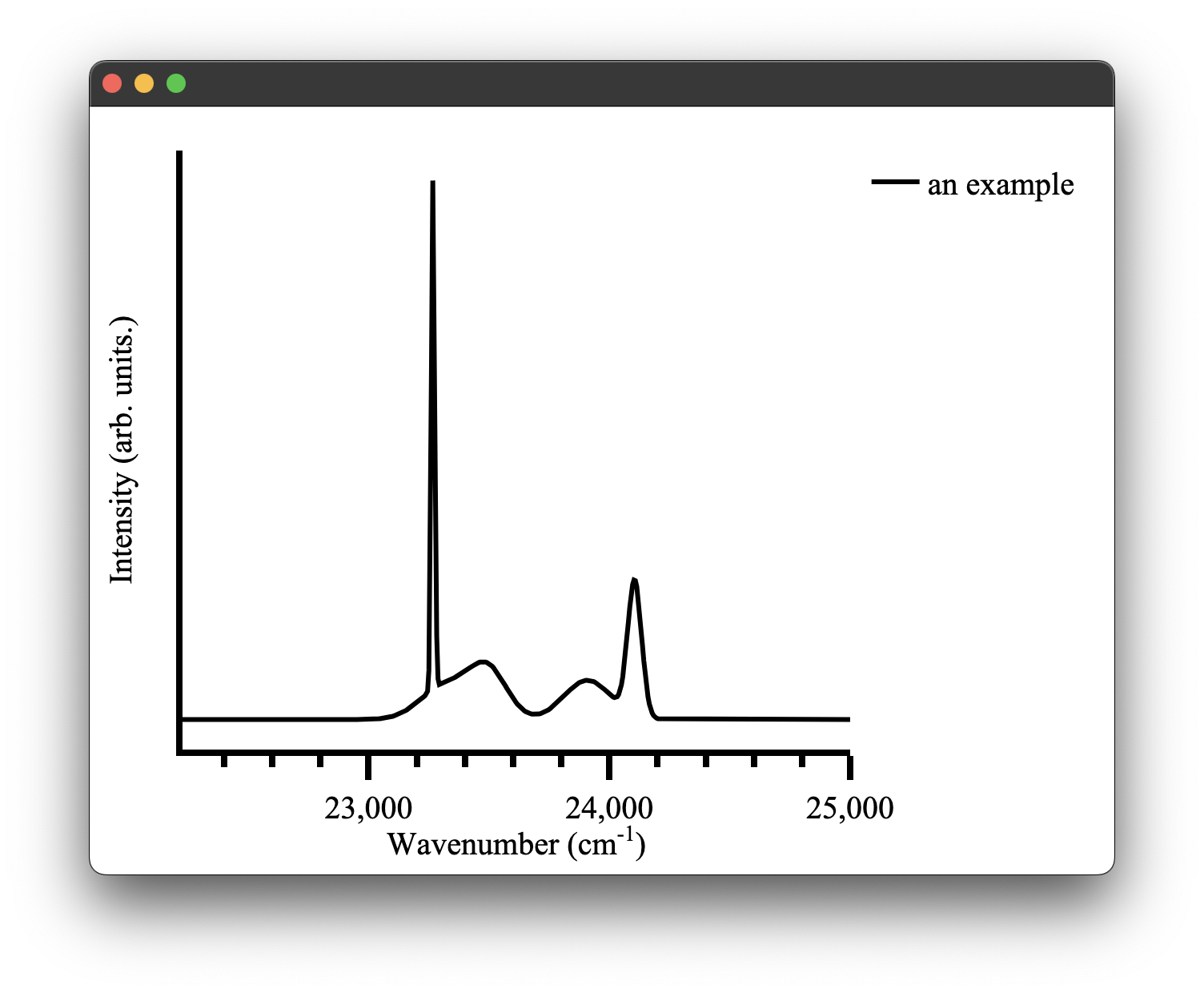
which gives us the following figure: