PYET-MC

A library to model energy transfer between lanthanide ions
Get in contact or follow research related to this project


![]()
Project Overview
Collection of tools for modelling the energy transfer processes in lanthanide-doped materials.
Contains functions for visualising crystal structure around a central donor ion, subroutines for nearest neighbour probabilities and monte-carlo based multi-objective fitting for energy transfer rates. This package aims to streamline the fitting process while providing useful tools to obtain quick structural information. The core function of this library is the ability to simultaneously fit lifetime data for various concentrations to tie down energy transfer rates more accurately. This allows one to decouple certain dataset features, such as signal offset/amplitude, from physical parameters, such as radiative and energy transfer rates. This is all handled by a relatively straightforward API wrapping the Scipy Optimise library. This library is based on the scripts initially written for studying multi-polar interactions between samarium ions in KY3F10 [1]
Road Map
Migrate a lot of the plotting functionality to✅Plotlyand wrap it in a matplotlib-like GUI. This work has started, an example of this transition can be found here & here.Update structure figures to use Jmol colour palette. Correct atom colours are coming soon!Move compute-heavy / memory-intensive functions to Rust for better performance.- Add more interaction types, e.g., cooperative energy transfer and other more complex energy transfer processes.
- Add geometric correction factors and shield factors for various crystal structures and ions [2].
- Add alternative to Monte Carlo methods e.g. the shell model(performance vs accuracy tests required). If successful, the shell model could improve performance greatly [3,4].
Move docs to MDbook for continuous integration.- Optional open-source database where results can be stored, retrieved, and rated based on data quality and fit, much like the ICCD crystallography database.
- Add more tests; this will be important as the project grows and other users want to add features.
Installation
pyet-mc is available on PyPI with pre-built wheels for Linux, macOS, and Windows. It requires Python 3.13 or newer.
Quick Install
Choose whichever environment manager you prefer — the examples below cover conda (via miniforge) and uv.
Using conda
Create and activate a new environment, then install pyet-mc:
conda create -n pyet python=3.13
conda activate pyet
pip install pyet-mc
Note: If you encounter dependency issues (particularly with
numpyormatplotlib), install them from conda-forge first:conda install -c conda-forge numpy matplotlib pip install pyet-mc
Using uv
uv is a fast, modern Python package manager. If you don't have it yet, see the uv installation guide.
Create a new project directory and add pyet-mc as a dependency:
uv init my-project --python 3.13
cd my-project
uv add pyet-mc
This creates a pyproject.toml, sets up a virtual environment, and installs pyet-mc along with all its dependencies. You can then run your scripts with:
uv run my_script.py
Verify the Installation
Create a new Python file (not inside the pyet-mc source tree) and try the following imports:
from pyet_mc.structure import Structure, Interaction
from pyet_mc.fitting import Optimiser, general_energy_transfer
from pyet_mc.pyet_utils import Trace, cache_reader, cache_list, cache_clear
from pyet_mc.plotting import Plot
If no errors appear, pyet-mc is ready to use. 🎉
Building From Source
Building from source is useful if you want to hack on pyet-mc itself or need a build for an unsupported platform. This requires the Rust toolchain and maturin.
Prerequisites
- Install Rust (via
rustup). - Install maturin — it will be pulled in automatically by the build, but you can also install it explicitly.
With uv (recommended)
git clone https://github.com/JaminMartin/pyet-mc.git && cd pyet-mc
uv venv --python 3.13
source .venv/bin/activate
uv sync
maturin develop --uv --release
With conda
git clone https://github.com/JaminMartin/pyet-mc.git && cd pyet-mc
conda create -n pyet-dev python=3.13
conda activate pyet-dev
pip install maturin
maturin develop --release
The compiled extension module is installed directly into your active virtual environment — the location of the cloned repository does not matter.
Generating a structure & plotting
Note a complete example of the following code can be found here
Generating a structure & plotting
Firstly, a .cif file must be provided. How you provide this .cif file is up to you! We will take a .cif file from the materials project website for this example. However, they also provide a convenient API that can also be used to provide .cif data. It is highly recommended as it provides additional functionality, such as XRD patterns. Information on how to access this API can be found here: https://next-gen.materialsproject.org/api. We can create our structure with the following code. However, this may differ if you are using the materials project API. It is also important to ensure your .cif file is using the conventional standard.
KY3F10 = Structure(cif_file= 'KY3F10.cif')
We then need to specify a central ion, to which all subsequent information will be calculated in relation to. It is important to note, we must specify the charge of the ion as well.
KY3F10.centre_ion('Y3+')
This will set the central ion to be a Ytrrium ion and yield the following output:
central ion is [-5.857692   -5.857692   -2.81691722] Y3+
with a nearest neighbour Y3+ at 3.914906764969714 angstroms
This gives us the basic information about the host material. Now we can request some information! We can now query what ions and how far away they are from that central ion within a given radius. This can be done with the following:
KY3F10.nearest_neighbours_info(3.2)
Output:
Nearest neighbours within radius 3.2 Angstroms of a Y3+ ion:
Species = F, r = 2.386628 Angstrom
Species = F, r = 2.227665 Angstrom
Species = F, r = 2.386628 Angstrom
Species = F, r = 2.227665 Angstrom
Species = F, r = 2.386628 Angstrom
Species = F, r = 2.227665 Angstrom
Species = F, r = 2.227665 Angstrom
Species = F, r = 2.386628 Angstrom
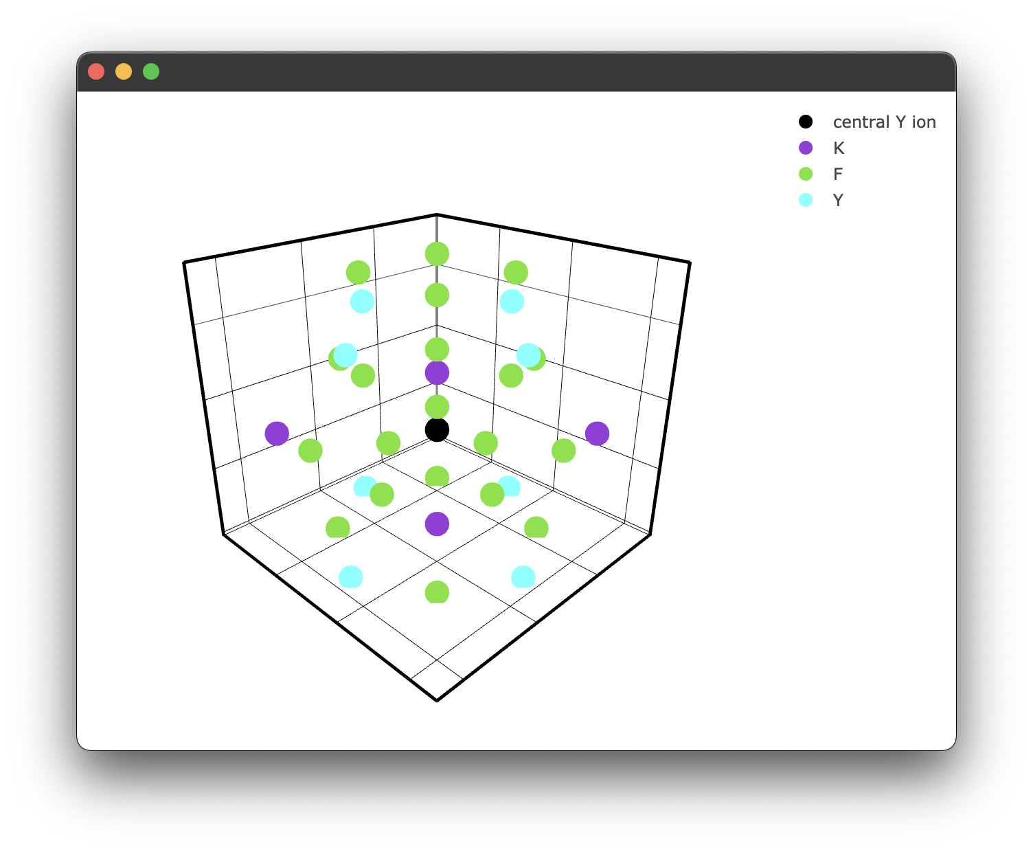
We can plot this if we like, but we will increase the radius for illustrative purposes. We can use the inbuilt plotting for this.
if __name__ == "__main__":
    fig1 = KY3F10.structure_plot(radius = 5)
    fig1.show()
Which yields the following figure:
It's worth noting here briefly that due to the way the PyWebEngine App is being rendered using the multiprocessing library, it is essential to include the if __name__ == "__main__": block. Unfortunately, until a different backend for rendering the Plotly .html files that also supports javascript this has to stay.
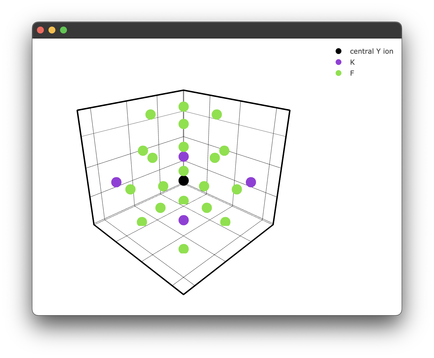
We can also specify a filter only to show ions we care about. For example, we may only care about the fluoride ions.
if __name__ == "__main__":
  filtered_ions = ['F-', 'K+'] #again, note we must specify the charge!

  fig2 = KY3F10.structure_plot(radius = 5, filter = filtered_ions)
  fig2.show()
This gives us a filtered plot:
Querying coordinates
The nearest_neighbours_info() method we used earlier is handy for a quick look at what's around the central ion, but it just prints text to the console. If you want the actual coordinate data for further analysis or custom workflows, there are two methods that return Pandas DataFrames.
nearest_neighbours_coords(radius) returns the Cartesian coordinates of all ions within the given radius:
coords = KY3F10.nearest_neighbours_coords(3.2)
print(coords)
          x         y         z species
0 -7.430692 -4.284692 -2.816917      F-
1 -4.284692 -5.857692 -1.044117      F-
2 -4.284692 -5.857692 -4.589717      F-
...
The returned DataFrame has columns x, y, z, and species.
nearest_neighbours_spherical_coords(radius) returns spherical polar coordinates relative to the central ion:
sph_coords = KY3F10.nearest_neighbours_spherical_coords(3.2)
print(sph_coords)
          r      theta        phi species
0  2.386628  90.000000 -135.00000      F-
1  2.227665  37.94576  -180.00000      F-
2  2.227665  142.05424 -180.00000      F-
...
The returned DataFrame has columns r (radial distance in Angstroms), theta (polar angle in degrees), phi (azimuthal angle in degrees), and species.
Think of nearest_neighbours_info() as the print-friendly summary and these two methods as the ones you reach for when you actually need the data, for example to feed into your own distance calculations, filtering logic, or visualisation code.
R₀ and the nearest neighbour distance
You may have noticed this line in the output when we called centre_ion():
with a nearest neighbour Y3+ at 3.914906764969714 angstroms
This comes from get_R0(), which is called automatically inside centre_ion(). You don't need to call it yourself. What it does is search for the closest ion of the same species as the central ion within 50 Angstroms and store that distance as self.r0.
This value, , is the nearest-neighbour distance and plays a key role in the interaction component formula:
The energy transfer rate between a donor and each acceptor ion at distance scales as , where depends on the interaction type (e.g. 6 for dipole-dipole, 8 for dipole-quadrupole). Because everything is normalised by , the nearest-neighbour distance effectively sets the scale for how quickly the transfer rate drops off with distance. A closer nearest neighbour means a larger and stronger coupling at any given .
If you ever need to inspect the value directly, it's available as an attribute after calling centre_ion():
print(KY3F10.r0) # e.g. 3.914906764969714
Energy transfer models
The energy transfer process can be modelled for a particular configuration of donor and acceptor ions with the following exponential function here is time, is the radiative decay rate, and is the energy transfer rate for this configuration. Assuming a single-step multipole-multipole interaction (currently, the only model implemented), may be modelled as a sum over the transfer rates to all acceptors takes the form:
Here is the distance between donor and acceptor, is the energy-transfer rate to an acceptor at the nearest-neighbour distance, and depends on the type of multipole-multipole interaction ( = 6, 8, 10 for dipole-dipole, dipole-quadrupole and quadrupole-quadrupole interactions respectively). The term forms the basis of our Monte Carlo simulation; we will refer to this as our interaction component. The lifetime for an ensemble of donors can be modelled by averaging over many possible configurations of donors and acceptors:
Where is the number of unique random configurations. We can also define an average energy transfer rate defined as: This is a useful value for comparing hosts at a similar concentration.
Modelling energy transfer processes
Note: Currently, only one energy transfer process has been implemented, so this section may be subject to change in future releases.
Consider the crystal structure we previously generated. We wish to "dope" that structure with some lanthanide ions randomly around some central donor ion. We will replace our previously defined "central yttrium atom" with a samarium. We will then randomly (based on the concentration of the dopant in the crystal) dope samarium ions around this central samarium ion. This step must be performed many times to "build up" many random unique samarium-samarium donor-acceptor configurations. When the number of random configurations is large enough, this should accurately represent a physical crystal sample. This is the Monte-Carlo aspect of our energy transfer analysis.
To generate our random samples, we utilise the interaction class. This class takes in our structure class and provides additional methods for calculating our interaction components and more specific plotting methods for doped crystals. We can enact this class simply by passing our structure to the interaction class:
crystal_interaction = Interaction(KY3F10)
Generating random dopant configurations is a two-step process. First, we compute the spherical coordinates of all same-species ions within a given radius of the central ion using distance_sim():
crystal_interaction.distance_sim(radius=10)
This populates crystal_interaction.filtered_coords with the coordinates of all candidate sites within the specified radius. These are all Y3+ ions — the sites that could be doped:
print(crystal_interaction.filtered_coords)
           r       theta         phi species
0   7.062817  115.108542 -115.648561     Y3+
1   7.062817  115.108542 -154.351439     Y3+
2   9.855419   55.821457 -135.000000     Y3+
3   7.062817   66.924234 -117.467113     Y3+
4   8.153300   90.000000 -135.000000     Y3+
..       ...         ...         ...     ...
Next, we call doper() to randomly assign dopant species to those sites based on a given concentration (in %) and retrieve the radial distances of the resulting dopant ions:
distances = crystal_interaction.doper(concentration=15, dopant='Sm3+')
By default, this returns a NumPy array of radial distances (in Angstroms) of the dopant samarium ions about the central samarium donor ion:
[8.28402747 7.17592429 7.17592429 9.33368811 8.28402747 4.30030493
 8.28402747 7.17592429 9.33368811 7.17592429 3.98372254 8.28402747]
If you want to see the full picture — which sites were doped and their complete spherical coordinates — pass return_coords=True:
doped_config = crystal_interaction.doper(concentration=15, dopant='Sm3+', return_coords=True)
print(doped_config)
           r       theta           phi species
0   7.175924  115.071364 -1.156825e+02       Y3+
1   7.175924  115.071364 -1.543175e+02       Y3+
2   8.284027   90.000000 -1.350000e+02       Y3+
3   7.175924   66.886668 -1.525658e+02       Y3+
4   7.175924   66.886668 -1.174342e+02      Sm3+
5   9.192125  109.317471 -1.800000e+02       Y3+
6   5.861968   92.188550 -1.800000e+02       Y3+
7   9.333688  162.434187 -1.800000e+02      Sm3+
..       ...         ...           ...       ...
This returns a DataFrame showing all candidate sites with their r, theta, phi, and species — where some Y3+ sites have been randomly replaced with Sm3+.
Note that doper() works non-destructively: it temporarily replaces a random subset of Y3+ sites with Sm3+ based on the concentration, extracts the result, and then resets filtered_coords back to the original Y3+ candidate sites. This means filtered_coords is always unchanged after calling doper() — only the returned value contains the result of a particular random doping configuration.
Each call to doper() produces a different random configuration — this is the basis of the Monte Carlo approach.
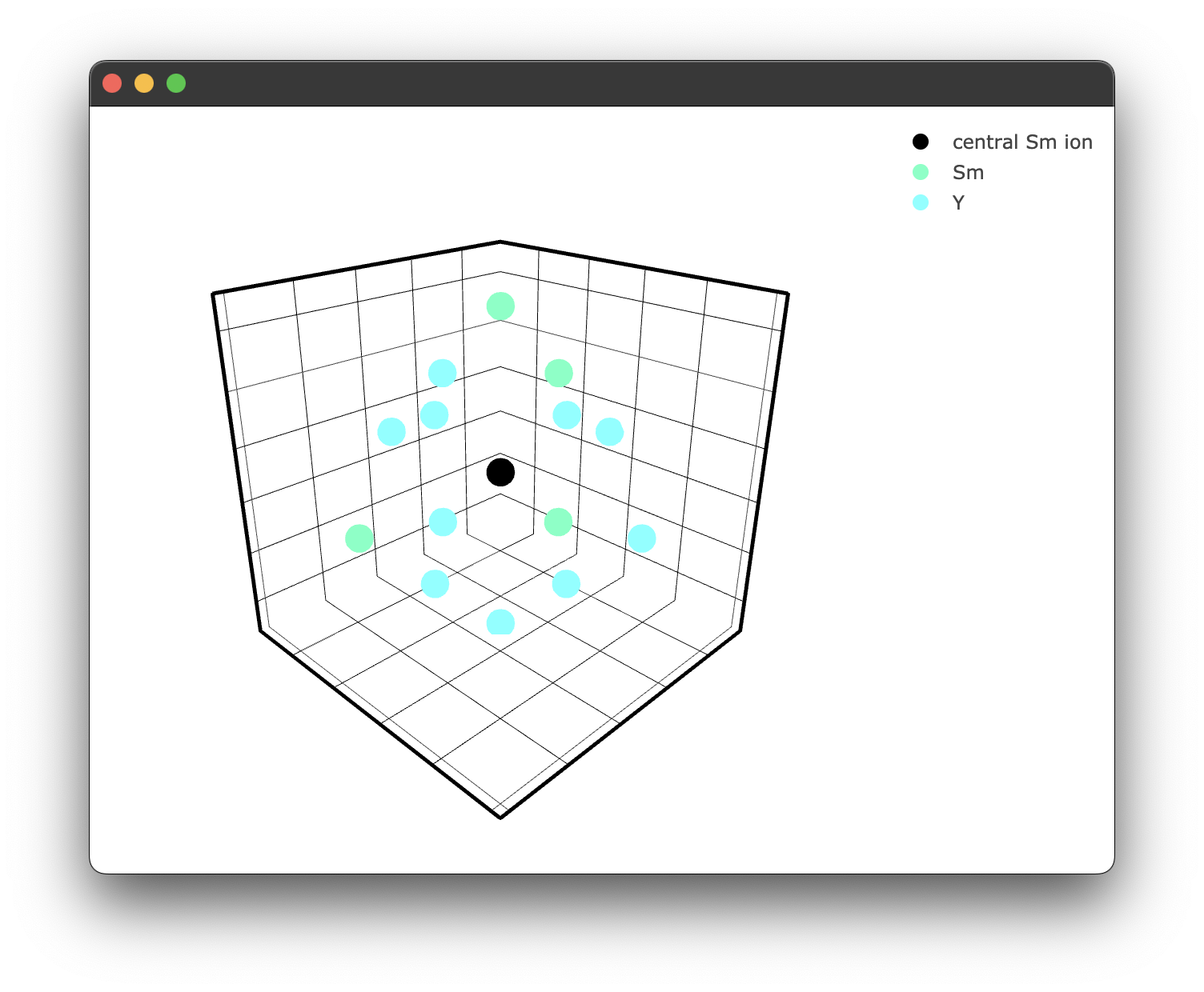
We can also visualise a doped structure to see what is happening; the interaction class has similar plotting functionality.
if __name__ == "__main__":
    fig3 = crystal_interaction.doped_structure_plot(radius=7.0, concentration = 15.0 , dopant = 'Sm3+' , filter = ['Y3+','Sm3+'])
    fig3.show()
The filter parameter controls which species are shown in the plot. If you omit it, every species in the structure will be plotted. If you provide it, it must be a list of species strings including their charge, e.g. 'Y3+' not 'Y'. Only the species in that list will appear. This is useful for decluttering plots when your structure has many species and you only care about a few of them.
yielding the following figure:
We can now calculate our interaction component for each random doping configuration. This is handled by the sim method, which currently is referred to as sim_single_cross as it is the only implemented method at the time of writing. This method handles both the distance_sim() and doper() steps internally, so you do not need to call them separately when using it. However, it is possible to add your own interaction model by wrapping distance_sim() and doper() for cooperative processes, for example.
interaction_components2pt5pct = crystal_interaction.sim_single_cross(radius=10, concentration = 2.5, interaction_type='DQ', iterations=20)
The sim method takes a radius, concentration, interaction type and number of iterations. The interaction type is given by a two-letter code, i.e. 'DQ' equals dipole-quadrupole. We will need more iterations than just 20 for fitting, closer to 50,000. If we rerun this now with 50,000 iterations, we get the following response:
file found in cache, returning interaction components
This is because I have already run this command, which has been cached. See the notes on caching here. The sim returns a Numpy array of interaction components that matches the number of iterations and will be utilised in our fitting process next!
We can then generate another set of interaction components for a 5% doped sample simply by changing the concentration
interaction_components5pct = crystal_interaction.sim_single_cross(radius=10, concentration = 5, interaction_type='DQ', iterations=50000)
The crystal interaction simulation can also accept the boolean flag intrinsic = True; this uses a modified formulation of the interaction components in the form
This gives us the energy transfer rate () or average energy transfer rate () in terms of a dopant ion 1 Å from the donor ion. The relevance of this is for work regarding an intrinsic energy rate. It is set to false by default as it is not as relevant at this stage; however, in future, it may be of interest.
Adding your own interaction model
Adding your own model should be relatively straightforward.
In the above code, we call the: .sim_single_cross method. You can add a different interaction method simply by defining a new function that can inherit the properties of the Interaction class e.g.
def sim_cooperative_energy_transfer(self, arg1, arg2, argn):
    # your code here # or you could write in in C or Rust and import it here

crystal_interaction = Interaction(KY3F10) # as shown before
crystal_interaction.sim_cooperative_energy_transfer = sim_cooperative_energy_transfer
We can then use this method as the above default example.
A note on caching
As these calculations can be quite time-consuming for large iterations, and for said large iterations, the difference between runs should be minimal, caching was implemented to speed up subsequent runs.
When first used, pyet will create a cache directory. All interaction simulations will cache their interaction components along with info regarding the simulation conditions in JSON format. The generated JSON file is named in the following convention:
process_radius_concentration_interactiontype_iterations_intrinsic_timedatestamp.json
Resulting in a file name:
singlecross_10_2pt5_DQ_1000_intrinsic_False_20240827080449.json
When generating interaction components it also takes note of the .cif file used, that way you can have multiple interaction components of identical parameters, but from different crystal structures.
We can query and return the interaction components of the JSON file with the following code:
from pyet_mc.pyet_utils import cache_reader, cache_clear, cache_list

interaction_components2pt5pct = cache_reader(process = 'singlecross', radius = 10 , concentration = 2.5 , iterations = 50000 , interaction_type = 'DQ', intrinsic = False, sourcefile = "KY3F10.cif")
interaction_components5pct =  cache_reader(process = 'singlecross', radius = 10 , concentration = 5 , iterations = 50000 , interaction_type = 'DQ', intrinsic = False, sourcefile = "KY3F10.cif")
If what you have specified is not found in the cache, there will be a console log such as this:
File not found, check your inputs or consider running a simulation with these parameters
This will also return a None type, which must be handled accordingly, such as using a Python match statement. However, most likely you won't run into this as the Interaction.sim_single_cross() method implements this before it runs anyway. If the query does return, it will return a Numpy array of our interaction components. In that case, the following is also displayed:
file found in cache, returning interaction components
Following a major update to pyet-mc, it is also recommended that you clear the cache in the event a bug is discovered in the existing code. This will be highlighted in any release notes.
This can be done using:
cache_clear()
This will prompt you if you are sure you would like to delete the cache.
Are you sure you want to delete all the cache files? [Y/N]?
You can also specify a file of a given simulation configuration, as was done above. In the event, you may have made a mistake and forgot to change a .cif file etc. It happens to the best of us...
If you want to know the status of your cache, you can also use the cache list to get the details, including file names and sizes. Like cache_clear(), a simple command is all you need!
cache_list()
#======# Cached Files #======#
[0] singlecross_10_2pt5_DQ_1000_intrinsic_False_20240827080449.json (18017 bytes), Source file: KY3F10.cif, Date created: 2024-08-27T08:04:49.396355
[1] singlecross_10_5pt0_DQ_1000_intrinsic_False_20240827080449.json (20593 bytes), Source file: KY3F10.cif, Date created: 2024-08-27T08:04:49.622935
Total cache size: 0.04 MB
Run "cache_clear()" to clear the cache
#============================#
You can then delete a selected file like so:
cache_clear(0)
File to delete: singlecross_10_2pt5_DQ_1000_intrinsic_False_20240827080449.json Source file: KY3F10.cif, Date created: 2024-08-27T08:04:49.396355
Are you sure you want to delete this file? [Y/N]
y
Deleted file: singlecross_10_2pt5_DQ_1000_intrinsic_False_20240827080449.json
Traces
The Trace class is a container for your experimental data. It bundles together the signal, time axis, a label, and the pre-calculated interaction components for a given concentration. This is the primary data structure you pass to the Optimiser for fitting and to the Plot.transient() method for plotting.
Creating a Trace
A basic Trace requires four things: your y-data (signal), x-data (time), a name, and the interaction components for that concentration.
from pyet_mc.pyet_utils import Trace

trace = Trace(ydata, xdata, 'my trace', interaction_components)
| Argument | Type | Description |
|---|---|---|
ydata | np.ndarray | The signal (y-axis) data points |
xdata | np.ndarray | The time (x-axis) data points |
fname | str | A label for the trace, used in plot legends |
radial_data | np.ndarray | The interaction components for this concentration, as returned by sim_single_cross() or cache_reader() |
weighting | int | Optional per-trace weighting for the fit. Defaults to 1 |
parser | str or False | Optional data reduction method. Defaults to False (no parsing) |
Data parsing
Real experimental data can be very densely sampled, particularly from oscilloscopes or time-correlated single photon counting systems. Fitting to hundreds of thousands of points is slow and often unnecessary. The parser option lets you thin out the data when constructing a Trace so the fitting runs faster without losing the important features of the decay.
There are three built-in parsers:
| Parser | What it does |
|---|---|
'parse_10' | Keeps every 10th data point |
'parse_100' | Keeps every 100th data point |
'parse_log' | Selects 500 points spaced logarithmically across the trace |
You specify the parser as a string when creating the Trace:
trace = Trace(ydata, xdata, '5%', interaction_components, parser='parse_100')
Both the signal and time arrays are thinned by the same indices, so they stay aligned. If no parser is specified the full dataset is used.
Choosing a parser
For most lifetime data, 'parse_100' is a good starting point. It reduces a 100,000 point trace down to 1,000 points, which is usually more than enough to capture the shape of the decay while making the fit significantly faster.
The 'parse_log' option is particularly useful for data that spans several orders of magnitude in time. It samples more densely at early times (where the signal changes rapidly) and more sparsely at late times (where the signal is slowly decaying). This gives better coverage of the fast initial dynamics without wasting points on the flat tail. It always returns 500 points regardless of the input length.
If you are unsure, try fitting with and without a parser and compare the results. The fitted parameters should be very similar. If they differ significantly it may be worth using a denser sampling or the full dataset.
Example with real data
import pandas as pd
from pyet_mc.pyet_utils import Trace

# Load experimental data from a CSV
data = pd.read_csv('lifetime_data.csv', header=None, names=['time', 'intensity'])

# Basic preprocessing
data.intensity = data.intensity - data.intensity.min()
data.time = data.time * 1000  # convert to ms

# Create a Trace with every 100th point
trace = Trace(
    data.intensity.to_numpy(),
    data.time.to_numpy(),
    '5% Sm:KY3F10',
    interaction_components,
    parser='parse_100'
)
Weighting
Each Trace can carry a weighting that influences how much it contributes to the fit. This is covered in detail in the weighted fitting documentation, but in short you can set it at construction time:
trace = Trace(ydata, xdata, '5%', interaction_components, weighting=5)
The default weighting is 1. The Optimiser also has an auto_weights feature that adjusts weightings to compensate for traces of different lengths, which is enabled by default.
Using Traces with the Optimiser
Once you have your Trace objects you pass them to the Optimiser along with the parameter names for each trace. See general fitting for the full workflow.
from pyet_mc.fitting import Optimiser

params_2pt5 = ['amp1', 'cr', 'rad', 'offset1']
params_5 = ['amp2', 'cr', 'rad', 'offset2']

opti = Optimiser([trace_2pt5, trace_5], [params_2pt5, params_5], model='rs')
Using Traces with plotting
The transient() plot method can accept a Trace directly. It will use the trace's time and signal data along with its name for the legend, so you don't have to pass these separately.
from pyet_mc.plotting import Plot

fig = Plot()
fig.transient(trace_2pt5)  # uses trace.time, trace.trace, and trace.name
fig.transient(trace_5)
fig.show()
This is equivalent to calling fig.transient(trace.time, trace.trace, name=trace.name) but saves you the repetition. See the transient plotting docs for more on plotting options like offset subtraction and log scale control.
Fitting experimental data to energy transfer models
The following covers the core aspect of this library, the fitting. The core purpose of this is to make the fitting of multiple lifetime data sets as simple as possible. It also allows for each dataset to contribute to a single fit rather than running multiple fits for different concentrations.
General Fitting
Recalling our two dipole-quadrupole datasets previously for 2.5% and 5% doping, respectively, If you do not have these generated interaction components, please refer to modelling energy transfer processes. We can use them to generate some artificial data given some additional parameters. For this particular model, we must provide it with four additional parameters: an amplitude, cross-relaxation rate (), a radiative decay rate, and horizontal offset.
#specify additional constants (the time based constants are in ms^-1)
const_dict1  = {'amplitude': 1 , 'energy_transfer': 500, 'radiative_decay' : 0.144, 'offset':0}
const_dict2  = {'amplitude': 1 , 'energy_transfer': 500, 'radiative_decay' : 0.144, 'offset': 0}
Note the units used here, the energy transfer and radiative rates are given in , it is more common to have these in , however here we are using for the purpose of generating data with a nice time scale. Now we can generate some synthetic data and plot it:
if __name__ == "__main__":
    # generate some random data
    time = np.arange(0,21,0.02) #1050 data points 0 to 21ms
    #Generate some random data based on our provided constants and time basis
    data_2pt5pct = general_energy_transfer(time, interaction_components2pt5pct, const_dict1)
    data_5pct = general_energy_transfer(time, interaction_components5pct, const_dict2)
    #Add some noise to make it more realistic
    rng = np.random.default_rng()
    noise = 0.01 * rng.normal(size=time.size)
    data_2pt5pct = data_2pt5pct + noise
    data_5pct = data_5pct + noise

    #Plotting
    fig4 = Plot()
    fig4.transient(time, data_2pt5pct)
    fig4.transient(time, data_5pct)
    fig4.show()
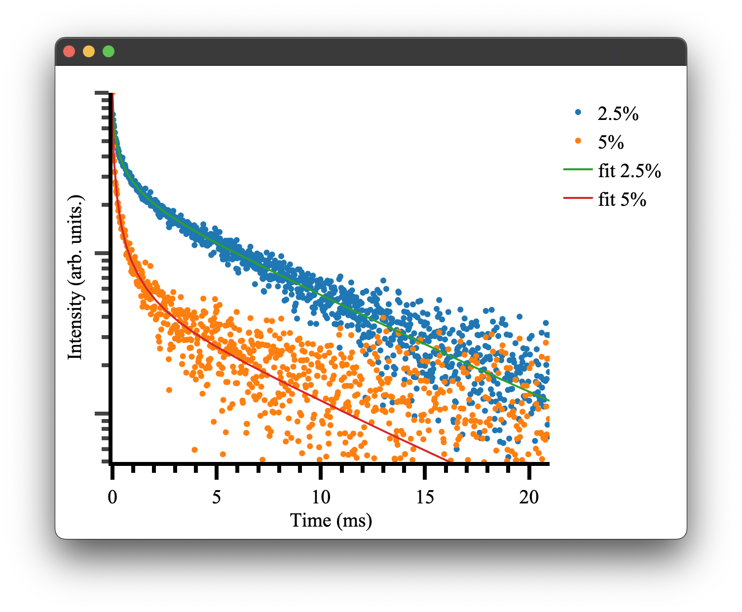
which gives the following result:
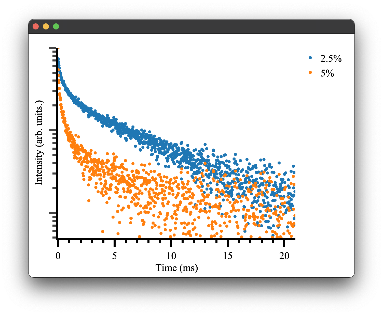
as we would expect! To see more details on how plotting and the Plot.transient() method works please see the plotting documentation.
We can attempt to fit the parameters initially used to generate this data. Pyet provides a wrapper around the scipy.optimise library to simultaneously fit multiple data traces that should have the same physical parameters, e.g. our radiative cross-relaxation rates while allowing our offset and amplitude to vary independently.
We must first specify our independent and dependent parameters. We can achieve this by giving our variables either different (independent variables) or the same name (dependent variables)
params2pt5pct = ['amp1', 'cr', 'rad', 'offset1']
params5pct = ['amp2', 'cr', 'rad', 'offset2']
We then construct a Trace object that takes our experimental data (e.g. signal, time), a label, and our interaction components. The Trace can also optionally thin out your data using a parser and carry a per-trace weighting for the fit, see the Traces documentation for details.
trace2pt5pct = Trace(data_2pt5pct, time,  '2.5%', interaction_components2pt5pct)
trace5pct = Trace(data_5pct, time, '5%', interaction_components5pct)
These objects and our list of variables can be passed to the optimiser for fitting.
opti = Optimiser([trace2pt5pct,trace5pct],[params2pt5pct,params5pct], model = 'default')
The model parameter controls which energy transfer model the optimiser uses internally. You have three options:
-
model='default'uses the pure Python/NumPy implementation ofgeneral_energy_transfer. This is the same model we used to generate the synthetic data above. It works everywhere and is the safest choice. -
model='rs'uses the Rust-accelerated parallel implementation, which is significantly faster for large datasets. This requires the Rust extension to be installed (see Rust Bindings). If the extension isn't available, the optimiser will fail at fit time, so only use this if you know the extension is installed. The parallel version will use all available CPU cores. If that is consuming too many resources or you are running multiple fits at once, usemodel='rs_single'instead, which uses the same Rust backend but runs on a single thread. -
A custom callable lets you pass your own model function directly. The function must accept
(time, radial_data, dictionary)wheretimeis a numpy array,radial_datais a numpy array of interaction components, anddictionaryis a dict of the current parameter values. It must return a numpy array of the same length astime. For example:
def my_model(time, radial_data, params):
    # your custom energy transfer model here
    return result

opti = Optimiser([trace1, trace2], [params1, params2], model=my_model)
We then give our model a guess. This can be inferred by inspecting the data or being very patient with the fitting / choice of the optimiser.
guess = {'amp1': 1, 'amp2': 1, 'cr': 100,'rad' : 0.500, 'offset1': 0 , 'offset2': 0}
As you can see, we only need to specify the unique set of parameters, in this case, six rather than eight total parameters. This will force the fitting to use the same cross-relaxation and radiative rates for both traces. This is what we would expect to be the case physically. The concentration dependence is handled by our interaction components. In a real experimental situation, you may only be able to have these parameters coupled if there is uncertainty in your actual concentrations. If your cross-relaxation parameters vary greatly, this is a good indication your concentrations used to calculate the interaction components are off.
Regardless, we can finally attempt to fit the data. We tell our optimiser to fit and give it one of the scipy.optimise methods and any other keywords, e.g. bounds or tolerance. The methods available all of those provided by scipy.optimise as well as dual-annealing, basinhoping and differential evolution. Details of their use can be found here here
res = opti.fit(guess, method = 'Nelder-Mead', tol = 1e-13)
This will return a dictionary of fitted parameters:
resulting fitted params:{'amp1': 0.9969421233991949, 'amp2': 0.9974422375924311, 'cr': 497.555275, 'rad': 0.146633387615, 'offset1': 0.0013088082858218686, 'offset2': 0.00020609427517915668}
Which is close to our given parameters and can be used to plot our final fitted results! There will also be some additional outputs regarding weightings, which is discussed here.
if __name__ == "__main__":
    rdict = res.x #the dictionary within the result of the optimiser

    fit1 = general_energy_transfer(time, interaction_components2pt5pct, {'a': rdict['amp1'], 'b': rdict['cr'], 'c': rdict['rad'],'d': rdict['offset1']})
    fit2 = general_energy_transfer(time, interaction_components5pct, {'a': rdict['amp2'], 'b': rdict['cr'], 'c': rdict['rad'], 'd': rdict['offset2']})

    fig5 = Plot()
    fig5.transient(trace2pt5pct, offset=rdict['offset1'])
    fig5.transient(trace5pct, offset=rdict['offset2'])
    fig5.transient(time, fit1, fit=True, name='fit 2.5%', offset=rdict['offset1'])
    fig5.transient(time, fit2, fit=True, name='fit 5%', offset=rdict['offset2'])
    fig5.show()
Note the transient() method can take either a Trace or x, y data. The option fit=True will display the data in line mode rather than markers.
Because transient plots use a log scale by default, fitted curves that include an offset term will bend downward at long time scales where the exponential has decayed and the constant offset dominates. To avoid this, pass the fitted offset to the offset parameter and it will be subtracted from the y-data before plotting. You need to do this for both the data traces and the fit curves so they stay consistent. See the transient plotting docs for more details on this and how it works with normalised data.
If you would rather see a linear y-axis you can also disable the log scale entirely with fig5.show(log_y=False).
Weighted Fitting
The Trace class supports per-trace weighting that influences how much each dataset contributes to the fit. There is also the ability to have the fitting process weight each trace differently, as well as adjust the weighting of all traces when their length is not even. Take, for example, the case where we have two traces of different lengths. We can generate this as before with some slight modifications.
if __name__ == "__main__":
    from pyet.fitting import general_energy_transfer
    # generate some random data
    time_1050 = np.arange(0,21,0.02) #1050 data points 0 to 21ms
    time_525 = np.arange(0,21,0.04) #525 data points 0 to 21ms
    #Generate some random data based on our provided constants and time basis
    data_2pt5pct = general_energy_transfer(time_1050, interaction_components2pt5pct, const_dict1)
    data_5pct = general_energy_transfer(time_525, interaction_components5pct, const_dict2)
    #Add some noise to make it more realistic
    rng = np.random.default_rng()
    noise_1050 = 0.01 * rng.normal(size=time_1050.size)
    noise_525 = 0.01 * rng.normal(size=time_525.size)
    data_2pt5pct = data_2pt5pct + y_noise
    data_5pct = data_5pct + y_noise
This is much the same as before, but now we have two datasets of different lengths. If we try to fit this by trying to minimise the Residual Sum of Squares (RSS) (which this library uses) the fit would be intrinsically biased to the dataset of longer length. We could instead use the Mean Squared Error (MSE) to account for this, but MSE is subject to biasing from outlier data. Instead, we add an appropriate weighting to the smaller datasets so that their contribution is proportional to that of the longer dataset. This method requires the assumption all data sets have a similar variance, which is fair for these kinds of measurements with good signal quality and high numbers of averages. This gives us a Weighted Residual Sum of Squares (WRSS) implementation. This re-weighting of data is implemented as a default method in the fitting optimiser class. So if we re-ran the fit with this new dataset we would see this output during the fit:
the weights of the 2.5% trace has been adjusted to 1.0
the weights of the 5% trace has been adjusted to 2.0
['amp1', 'amp2', 'cr', 'rad', 'offset1', 'offset2']
Guess with initial params:{'amp1': 1, 'amp2': 1, 'cr': 100, 'rad': 0.5, 'offset1': 0, 'offset2': 0}
Started fitting...
This aims to compensate for the discrepancy in the number of data points. However, it can be turned off if it is not a desired feature simply by changing the instantiation of the optimiser to have auto_weighting set to False.
opti = Optimiser([trace2pt5pct,trace5pct],[params2pt5pct,params5pct], model = 'default', auto_weights = False)
There is also the ability to set a per-trace weighting to each Trace so that it intentionally biases the fitting process to try to either fit more or less to that data set. This is useful in the case where we have less than ideal data that we don't want to influence the fit or in the case we have ideal data that we want to fit more heavily to. To add a weighting factor to a trace it is as simple as declaring that when we create our Trace objects. Let's imagine the case where we want to weight our smaller dataset further for some contrived reason. We can simply add a weighting to that Trace. Note that by default the weighting is set to one.
trace2pt5pct = Trace(data_2pt5pct, time,  '2.5%', interaction_components2pt5pct)
trace5pct = Trace(data_5pct, time, '5%', interaction_components5pct, weighting = 5)
This would yield the following when fitting:
the weights of the 2.5% trace have been adjusted to 1.0
the weights of the 5% trace have been adjusted to 10.0
['amp1', 'amp2', 'cr', 'rad', 'offset1', 'offset2']
Guess with initial params:{'amp1': 1, 'amp2': 1, 'cr': 100, 'rad': 0.5, 'offset1': 0, 'offset2': 0}
Started fitting..
As you can see, the weighting has actually been adjusted to 10; this is due to the automatic re-weighting ensuring the weighting we provide is a weighting for equal datasets. If you don't want to use the automatic re-weighting but restain your weighting of 5 you can simply turn off automatic re-weighting as discussed.
There is no right or wrong way to implement these weights and should be addressed on a case-by-case basis, as they can heavily influence your fitted parameters.
Fitting Algorithms
Under the hood, pyet-mc wraps scipy.optimize to do all of its fitting. The Optimiser.fit() method lets you pick a solver and pass any extra *args or **kwargs straight through to the underlying scipy function. This means anything scipy supports (tolerances, callback functions, method selection, etc.) you can use directly.
The basic signature looks like this:
res = opti.fit(guess, bounds=None, solver="minimize", *args, **kwargs)
guessis a dictionary of your initial parameter values.boundsis an optional dictionary of(min, max)tuples (required for some solvers).solveris a string selecting which scipy solver to use.- Everything else gets forwarded to scipy.
Solvers
minimize
This is the default solver and the one you will probably use most often. It calls scipy.optimize.minimize and supports all of its local optimization methods (Nelder-Mead, L-BFGS-B, Powell, etc.) via the method keyword argument.
Bounds: Not passed to scipy by this solver. If you need bounded local optimization, pick a method that handles bounds internally (like L-BFGS-B) and pass them through **kwargs.
When to use it: You have a reasonable initial guess and want a fast, reliable local fit.
guess = {'amp1': 1, 'amp2': 1, 'cr': 100, 'rad': 0.5, 'offset1': 0, 'offset2': 0}

# Nelder-Mead is a solid default choice
res = opti.fit(guess, solver="minimize", method='Nelder-Mead', tol=1e-13)

# Or try Powell for a different local search strategy
res = opti.fit(guess, solver="minimize", method='Powell', tol=1e-12)
Since "minimize" is the default solver, you can also just omit it:
res = opti.fit(guess, method='Nelder-Mead', tol=1e-13)
basinhopping
Calls scipy.optimize.basinhopping. This is a global optimization method that combines random perturbation of coordinates with local minimization. It is good at escaping local minima.
Bounds: Not required (not passed to scipy by this solver).
When to use it: Your initial guess might not be close to the true solution, or the cost surface has lots of local minima. It is slower than minimize but more robust.
guess = {'amp1': 1, 'amp2': 1, 'cr': 200, 'rad': 1.0, 'offset1': 0, 'offset2': 0}

res = opti.fit(guess, solver="basinhopping", niter=100, T=1.0)
Here niter and T (temperature) are forwarded directly to scipy.optimize.basinhopping.
differential_evolution
Calls scipy.optimize.differential_evolution. This is a stochastic population-based global optimizer. It explores the parameter space broadly, so it can find solutions even when your guess is poor.
Bounds: Required. You must provide a bounds dictionary.
When to use it: You have little idea where the solution is, but you can define a reasonable search region. It is thorough but can be slow for high-dimensional problems.
guess = {'amp1': 1, 'amp2': 1, 'cr': 200, 'rad': 1.0, 'offset1': 0, 'offset2': 0}

bounds = {
    'amp1': (0, 2),
    'amp2': (0, 2),
    'cr': (1, 1000),
    'rad': (0.01, 10),
    'offset1': (-0.1, 0.1),
    'offset2': (-0.1, 0.1),
}

res = opti.fit(guess, bounds=bounds, solver="differential_evolution", tol=1e-10)
The guess is used as the x0 starting point within the bounded region.
dual_annealing
Calls scipy.optimize.dual_annealing. This is another global optimization method inspired by simulated annealing. It balances exploration of the search space with refinement near promising solutions.
Bounds: Required. You must provide a bounds dictionary.
When to use it: Similar situations to differential_evolution. Dual annealing can sometimes converge faster depending on the problem. Worth trying if differential evolution is too slow or gets stuck.
guess = {'amp1': 1, 'amp2': 1, 'cr': 200, 'rad': 1.0, 'offset1': 0, 'offset2': 0}

bounds = {
    'amp1': (0, 2),
    'amp2': (0, 2),
    'cr': (1, 1000),
    'rad': (0.01, 10),
    'offset1': (-0.1, 0.1),
    'offset2': (-0.1, 0.1),
}

res = opti.fit(guess, bounds=bounds, solver="dual_annealing", maxiter=1000)
Bounds Format
When you need to pass bounds, provide a dictionary where the keys match your guess dictionary and the values are (min, max) tuples:
bounds = {
    'amp1': (0, 2),       # amplitude between 0 and 2
    'cr': (1, 1000),      # cross-relaxation rate between 1 and 1000
    'rad': (0.01, 10),    # radiative rate between 0.01 and 10
    'offset1': (-0.5, 0.5),
}
The keys in bounds should match the keys in your guess dictionary. For differential_evolution and dual_annealing, you need bounds for every parameter. If you leave bounds out (or pass None), it defaults to an empty dictionary, which is fine for minimize and basinhopping.
Plotting
The pyet-mc library comes with a built-in plotting library that 1. Provides a matplotlib style plotting wrapper for Plotly. It achieves this by rendering Plotly's html + js figures in a Qt5 WebEngine in a separate Python process.
It also provides sensible defaults for plotting the spectra, lifetimes and crystal structures that may be of use to people not taking advantage of the fitting functionality of this library. Lastly, it features a unique plotting configuration method to make your code more readable at more readily checked between peers without clutter associated with plotting configuration.
Types of plots
Currently, there are three implemented plotting types. They are spectra, transient and structure_3d which are wrappers for Plotly's go.Scatter() and go.Scatter3d respectively. Where transient is specifically used for plotting lifetime data on a log scale.
Details of each plot type can be found here:
Spectra plots
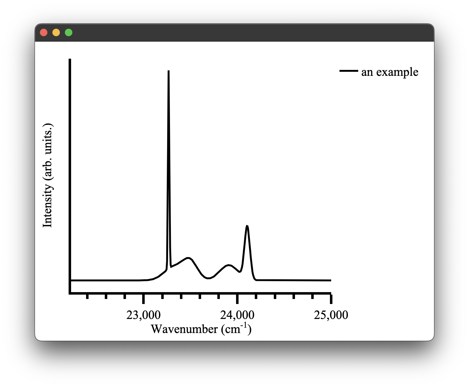
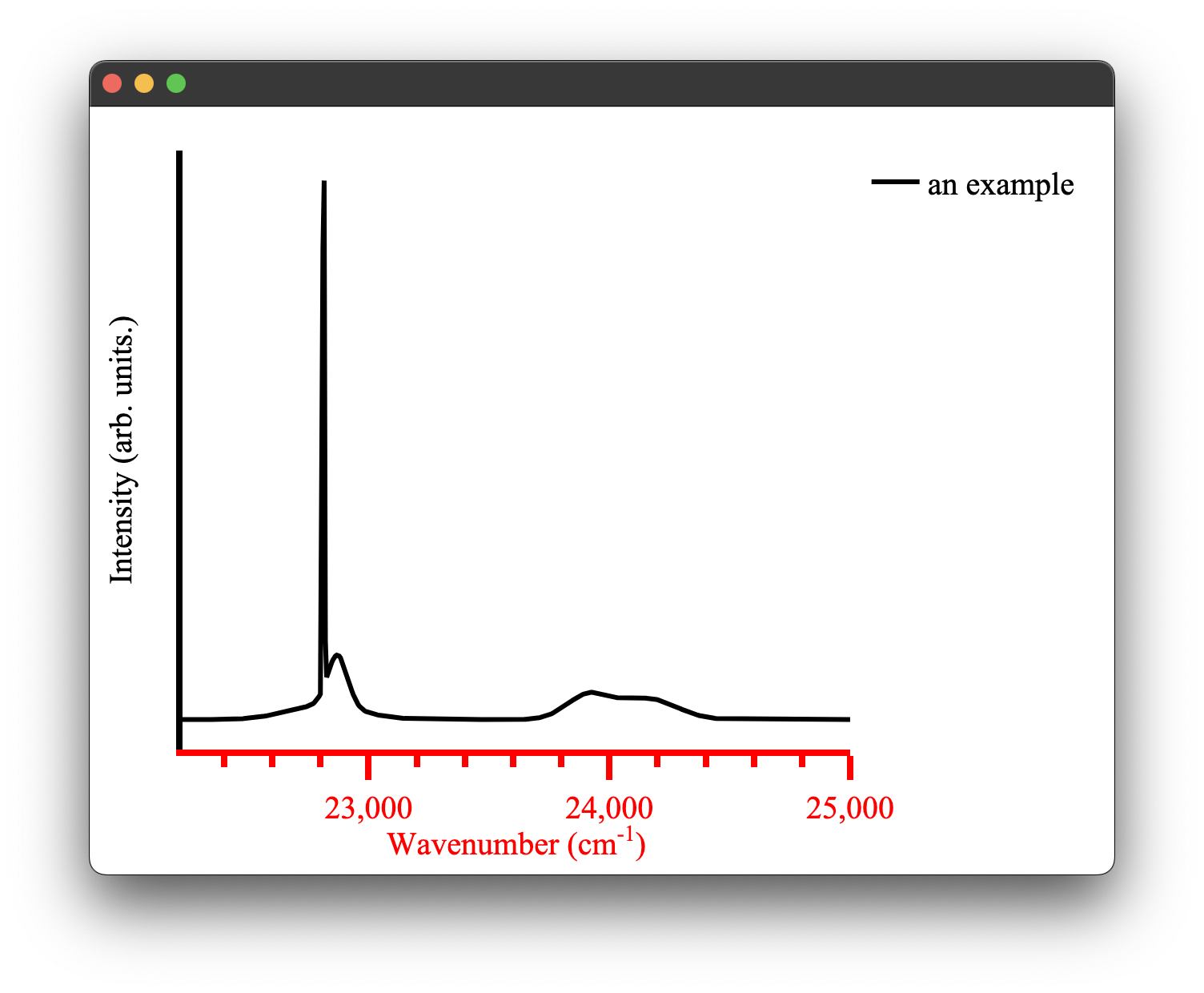
A spectra plot is a simple x,y plot of spectroscopic data with sensible defaults. It will for example, automatically find an appropriate major and minor tick spacing. It defaults to using wavenumbers as the x axis as that is what we commonly use in our research group. This can be easily overridden, however (see configuring plots) the goal is to be able to produce fast plots of spectra with sensible defaults that can be stylized to your tastes after.
We can create a spectra plot simply with this code:
from pyet_mc.plotting import Plot
from pyet_mc.pyet_utils import random_spectra
if __name__ == "__main__":
    wavelengths = np.arange(400,450, 0.1) #generate some values between 400 and 450 nm
    wavenumbers, signal = random_spectra(wavelengths, wavenumbers=True)
    figure = Plot()
    figure.spectra(x, y, name = 'an example') #give the data a name for the legend
    figure.show()
which gives us the following figure:
Transient plots
The figures plotted using the transient plot type have been shown extensively in the section on fitting however it is worth discussing the purpose and limitations of this plot type.
The goal of this plot type is to quickly plot transients on an appropriate log scale for easy interpretation. It does, however, have its limitations - It may not correctly display this data, if so you may have to look at setting custom x,y axis limits. It then plots ~3 orders of magnitude on the y-axis and the x-axis limits are set from zero to the maximum value of your data. The x-axis label default is milliseconds; however, as was the case for the spectra plot, this can be easily reconfigured to an appropriate time base.
The transient plot type is designed to handle either x,y data as might be returned from the fitting process, for example, or it can take a Trace. This was to minimise code/data duplication. If you have defined a Trace for your data and given it a name, you can pass this in directly without having to worry about providing any y values.
Subtracting offsets
When plotting fitted results on a log scale, you may notice that the fit curves bend downward at long time scales. This is not a fitting error. It happens because the energy transfer model includes a constant offset term, and at long times the exponential part of the signal decays away leaving just that offset. On a log scale this constant dominates and creates a visible bend or plateau in the tail of the curve.
To handle this, the transient method accepts an offset parameter. This subtracts a baseline value from the y-data before plotting, removing the constant term that causes the visual artifact.
rdict = res.x

fig = Plot()
# Subtract the fitted offset from data and fit curves
fig.transient(trace2pt5pct, offset=rdict["offset1"])
fig.transient(time, fit1, fit=True, name="fit 2.5%", offset=rdict["offset1"])
fig.show()
The offset defaults to 0.0 so existing code is unaffected.
Normalised data
If you have normalised your data (e.g. dividing by np.max(fit)) you will likely find the offset subtraction is not necessary. Normalising pushes the offset so far from the log scale floor that it has no visible effect. In that case you can just plot as normal:
fig.transient(time, fit1 / np.max(fit1), fit=True, name="fit 2.5%")
If for some reason you still need to subtract it on normalised data, the normalised offset is simply the raw offset scaled by the same factor:
norm_offset = rdict["offset1"] / np.max(fit1)
fig.transient(time, fit1 / np.max(fit1), fit=True, name="fit 2.5%", offset=norm_offset)
Disabling the log scale
By default, calling show() on a transient plot forces the y-axis to a log scale. If you would rather see a linear y-axis (for example, to inspect the offset behaviour directly) you can disable this:
fig.show(log_y=False)
This can be useful for debugging fits or when plotting data where a log scale is not appropriate. The default is log_y=True so existing code behaves the same as before.
Structure plots
The structure plots use Ploty's go.Scatter3d as their base. Unlike the previous two plot types, the structure plotting is handled by the structure3d plotting method, which is in turn wrapped by the Structure and Interaction plotting methods. These two methods leverage structure3d and its defaults to produce the structure plots we have seen earlier. It is however possible to bypass those structure plots if you don't have a .cif file or you want to write your own more general 3D plot.
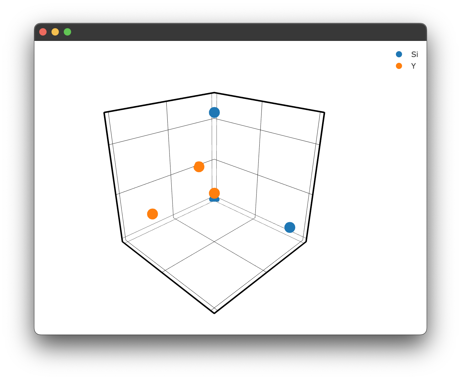
To create a 3D plot without using a .cif file and Structure.structure_plot() or Interaction.doped_structure_plot() we simply need to use the methods we used for the spectra & transient plot types:
figure = Plot()

figure.structure_3d([0,1,2],[0,5,2],[0,1,5], name = 'Si')
figure.structure_3d([5,1,1],[2,0,1],[2,2,1], name='Y')
figure.show()
which gives us the following figure:
Configuring plots
There are a few ways to change the configuration of plots in pyet-mc. The most straight forward one is to directly pass layout arguments when creating our plot type. These layout arguments are just standard Plotly arguments and you can refer to their documentation for a full list of them. However, I shall show a few common examples.
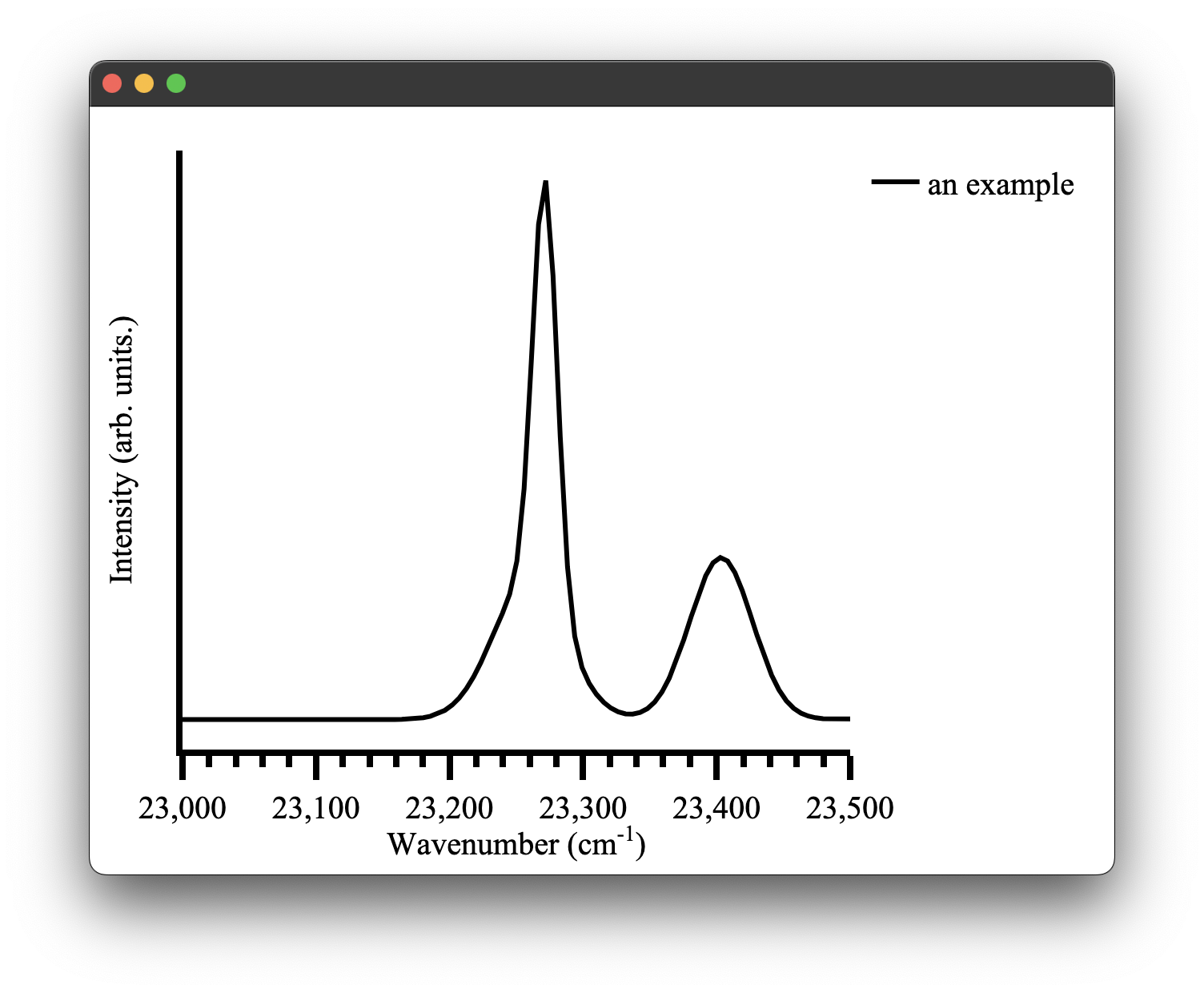
The obvious one would be that the automatic x-axis range calculation of pyet-mc might not be quite what you want it to be. This can be easily changed by overwriting the defaults as we just discussed.
wavelengths = np.arange(400,450, 0.1) #generate some values between 400 and 450 nm
wavenumbers, signal = random_spectra(wavelengths, wavenumbers=True)
x_range = [23000,23500]
ticks = 50
figure = Plot(xaxis={'range': x_range,'dtick': 100})
figure.spectra(wavenumbers, signal, name = 'an example') #give the data a name for the legend
figure.show()
It is also easy to update the style of the data on the plot using a similar method:
wavelengths = np.arange(400,450, 0.1) #generate some values between 400 and 450 nm
wavenumbers, signal = random_spectra(wavelengths, wavenumbers=True)
x_range = [23000,23500]
ticks = 50
figure = Plot(xaxis={'range': x_range,'dtick': 100,})
figure.spectra(wavenumbers, signal, name='an example', mode='markers', marker={'color': 'red'})
figure.show()

While it is quite easy to specify a marker mode or colour for each dataset on a plot inline like the examples above, it becomes quite obtuse to do this for the plot layout configuration as there are far more options. This is greatly exemplified when you have multiple Python files plotting different sets of data but you want them to all have the same formatting, say for a thesis or publication. In pyet-mc a configuration method was introduced to simplify the layout configuration of Plotly plots. This is where all the default plot layouts are configured and, therefore, aren't hard-coded into the plotting functionality directly. When the plotting library is loaded it also loads this config file. Any arguments passed to the Plot() class overwrite it. However, it also means you can just directly modify this file and all your plots will be created with this layout by default!
The config file is a simple .toml file type,
and the general layout of the plotting_congfig.toml file is:
[spectra_layout]
  title_text = ""
  showlegend = true
  title = ''
  margin = { l = 50, r = 50, t = 20, b = 70 }
  paper_bgcolor = "white"

  [spectra_layout.font]
    family = 'Times New Roman, monospace'
    size = 20
    color = 'black'

  [spectra_layout.xaxis]
    title = 'Wavenumber (cm<sup>-1</sup>)'
    exponentformat = 'none'
    showgrid = false
    showline = true
    tickmode = 'linear'
    ticks = 'outside'
    showticklabels = true
    linewidth = 4
    linecolor = 'black'
    ticklen = 15
    tickwidth = 4
    tickcolor = 'black'


    ...
where each of the three currently available plotting types has their layouts configured here. A full example of this file can be found in the src/pyet/plotting_config/ directory of the package on Github or wherever your Python package manager installed the library. You can directly edit the file there once the package has been installed. This is not the recommended way to provide a user-configured config file as it runs the risk of completely breaking the functionality of the library if you misconfigure it with no ability to fall back (unless, of course, you make a copy of the file or re-download it from this repo). Instead, you can use a pyet-utils function called load_local_config to load a local configuration from a specified directory. In this example we will change the x-axis colour scheme to red in our local config file.
[spectra_layout]
  title_text = ""
  showlegend = true
  title = ''
  margin = { l = 50, r = 50, t = 20, b = 70 }
  paper_bgcolor = "white"

  [spectra_layout.font]
    family = 'Times New Roman, monospace'
    size = 20
    color = 'black'

  [spectra_layout.xaxis]
    title = 'Wavenumber (cm<sup>-1</sup>)'
    exponentformat = 'none'
    showgrid = false
    showline = true
    tickmode = 'linear'
    ticks = 'outside'
    dtick = 50
    showticklabels = true
    linewidth = 4
    linecolor = 'red'
    ticklen = 15
    tickwidth = 4
    tickcolor = 'red'

    [spectra_layout.xaxis.minor]
      ticks = 'outside'
      ticklen = 7
      showgrid = false

    [spectra_layout.xaxis.tickfont]
      family = 'Times new roman, monospace'
      size = 20
      color = 'red'

    [spectra_layout.xaxis.title]
      text = 'Wavenumber (cm<sup>-1</sup>)'
      [spectra_layout.xaxis.title.font]
        family = 'Times new roman, monospace'
        size = 20
        color = 'red'
By simply adding the load_local_config function we can update our plots:
load_local_config('/path/to/your/local_plotting_config.toml')
figure = Plot()
figure1.spectra(wavenumbers, signal, name='an example')
figure.show()
easy as that!
This can be done for all three plot types. A complete list of optional layout features can be found in Ploty's documentation for the parent plot type of the three plots currently implemented in this library.
Saving plots
Under the hood, pyet-mc's plotting library leverages Plotly's saving method, therefore it is very simple to save a figure.
We provide a save path and file name with the appropriate file extension (e.g. .svg, .pdf for a full list consult the Plotly documentation here)
path = '/path/to/store/'
name = 'file.svg'
figure.save(path, name)
If any errors arise from the plotting, it is again best to consult the Plotly documentation regarding saving figures, as it may require installing the kaleido package separately.
[1] J.L.B. Martin, M.F. Reid, and J-P.R. Wells. Dipole–Quadrupole interactions between Sm3+ ions in KY3F10 nanocrystals. Journal of Alloys and Compounds (2023).
[2] T. Luxbacher, H.P. Fritzer, J.P. Riehl, C.D. Flint. The angular dependence of the multipole–multipole interaction for energy transfer. Theoretical Chemistry Accounts (1999).
[3] T. Luxbacher, H.P. Fritzer, C.D. Flint. Competitive cross-relaxation and energy transfer within the shell model: The case of Cs2NaSmxEuyY1-x-yCl6. Journal of Luminescence (1997).
[4]
T. Luxbacher, H.P. Fritzer, C.D. Flint. Competitive cross-relaxation and energy transfer in Cs2NaSmxEu
Rust Bindings
pyet-mc includes a Rust extension module that provides a faster implementation of the energy transfer model. If you installed from PyPI, the extension is bundled in the wheel and ready to go.
Using the Rust backend
Pass model='rs' when creating your Optimiser:
opti = Optimiser([trace1, trace2], [params1, params2], model='rs')
This uses a parallel Rust implementation that splits the computation across your CPU cores using Rayon. For large datasets (many time points, high iteration counts, multiple traces) this is noticeably faster than the pure Python/NumPy version and uses less memory.
Single-threaded mode
The parallel version will use all available cores by default. If that is consuming too many resources or you are running multiple fits at once, you can use the sequential Rust implementation instead:
opti = Optimiser([trace1, trace2], [params1, params2], model='rs_single')
This gives you the same performance benefits over Python (no intermediate array allocations, tight loop) without the parallelism. It is a good choice when you want the Rust speedup but need to keep CPU usage under control.
Summary
| Model | Backend | Parallelism |
|---|---|---|
'default' | Python/NumPy | No |
'rs' | Rust (Rayon) | Yes, across time points |
'rs_single' | Rust | No |
What if the extension isn't available?
If the Rust module can't be imported (unsupported platform, source build without Rust, etc.) you will see a warning on import and model='default' will still work fine. Only model='rs' and model='rs_single' require the extension.
If you need to build it yourself, see the installation docs. You will need the Rust toolchain and maturin.
Troubleshooting
- pyet is using too much memory:
- this is a known issue. Numpy does not seem to free up its arrays fast enough, so it can consume a lot of memory. For example, a 50,000 iteration interaction component and 15,000 time points will consume 6GB of memory. This is why this library does not use pre-allocation, as it is too easy to accidentally run out of memory and use swap memory, slowing things down further. I have a Rust implementation that does not suffer from this issue due to better memory management; This will be part of future releases.
- pyet is slow:
- this is also a known issue. This boils down to the number of exponential calls. This is documented here: https://github.com/JaminMartin/pyet-mc/issues/2
The latter two of these issues have been addressed by including Rust bindings described here.
- pyet does not converge to a good fit
- This could be for a multitude of reasons. The most probable is either the tolerance for the fit or the fitting algorithm. Try decreasing your tolerance and trying some different methods. Global optimise will soon be available to help remedy the need for good initial guesses. The concentration specified for the interaction component may not be accurate; this, alongside the cross-relaxation parameter being coupled to all traces, may cause an inability to converge. Try to fit with them uncoupled. If you continue to have trouble just reach out! there could be a bug in my code!
Referencing this project
To reference this project, you can use the citation tool in the About info of this repository. Details can also be found in the .cff file in the source code.
License
The project is licensed under the GNU GENERAL PUBLIC LICENSE.